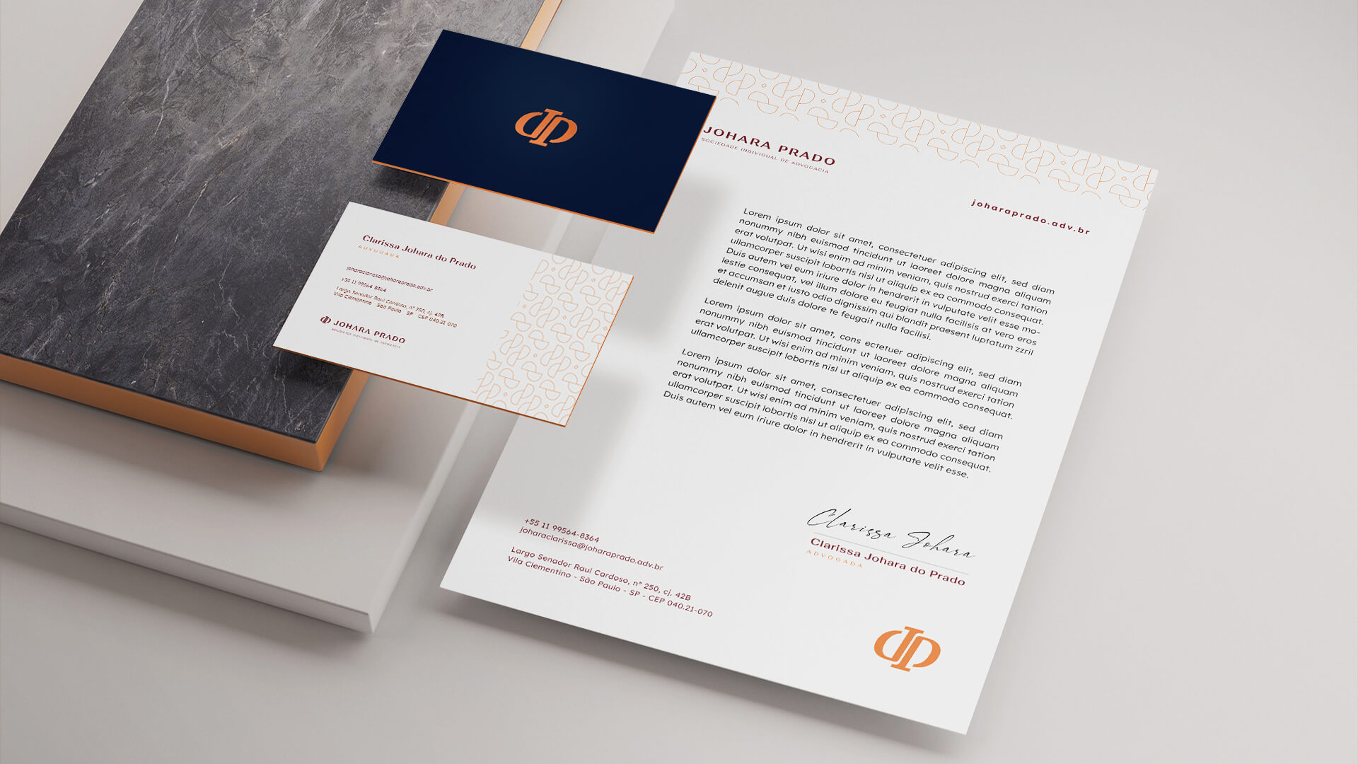
The brand
The proposal brings a minimalist, clean, discreet and elegant concept.
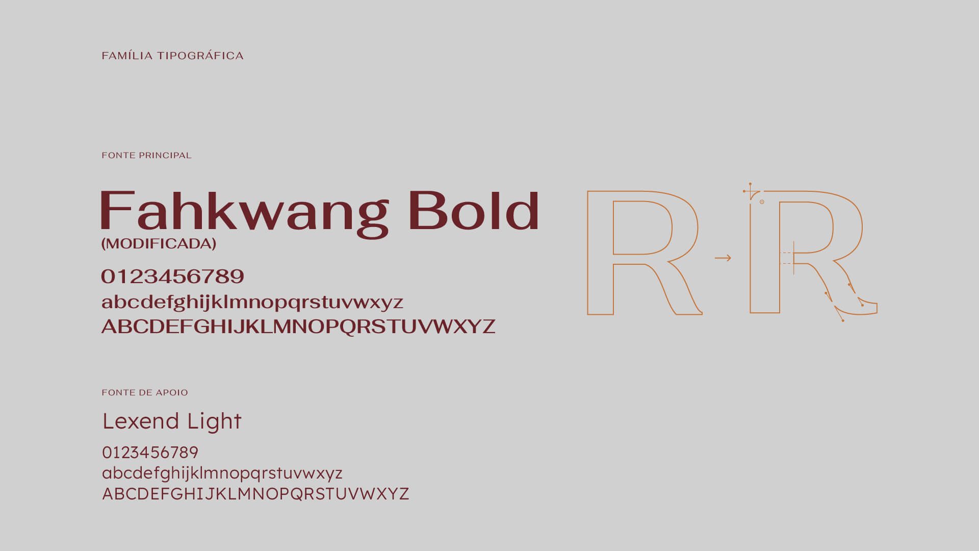
The font used is modern and imposing, modified to feature more rounded corners and cuts that refer to the concept of the symbol that accompanies the brand.
The spacing is generous and the capital letters convey strength and credibility.
The composition brings a humanist air that conveys an idea of modernity and lightness. The curved extensions in some parts of the font bring a soft, feminine touch to complement the design.
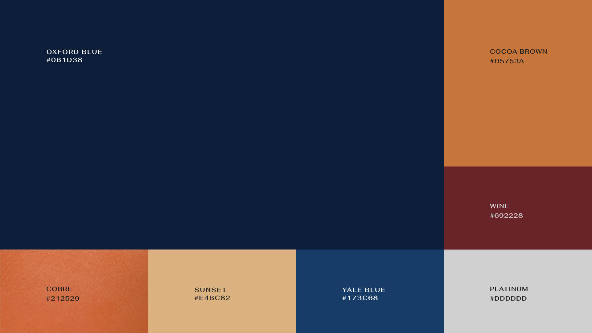
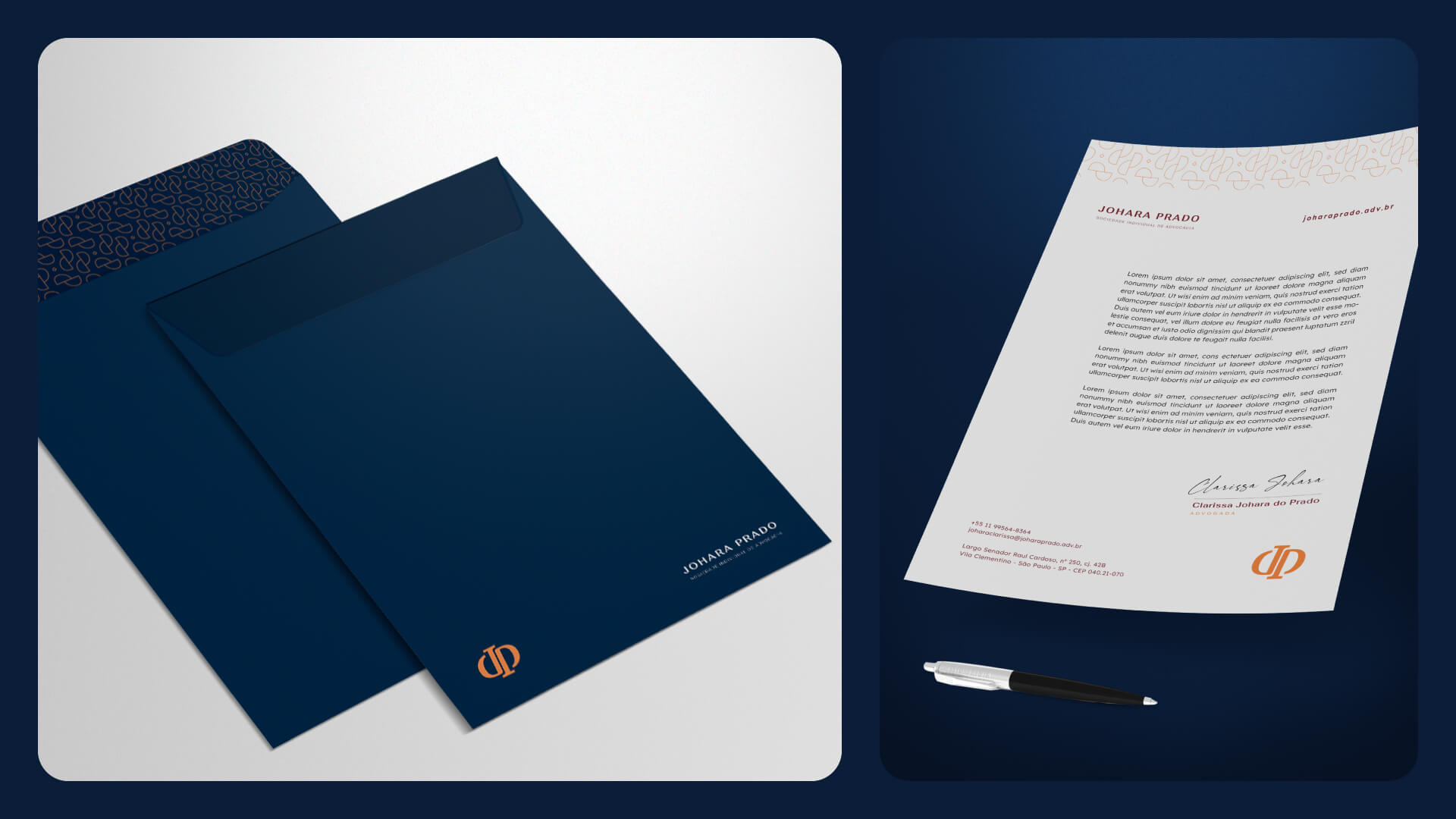
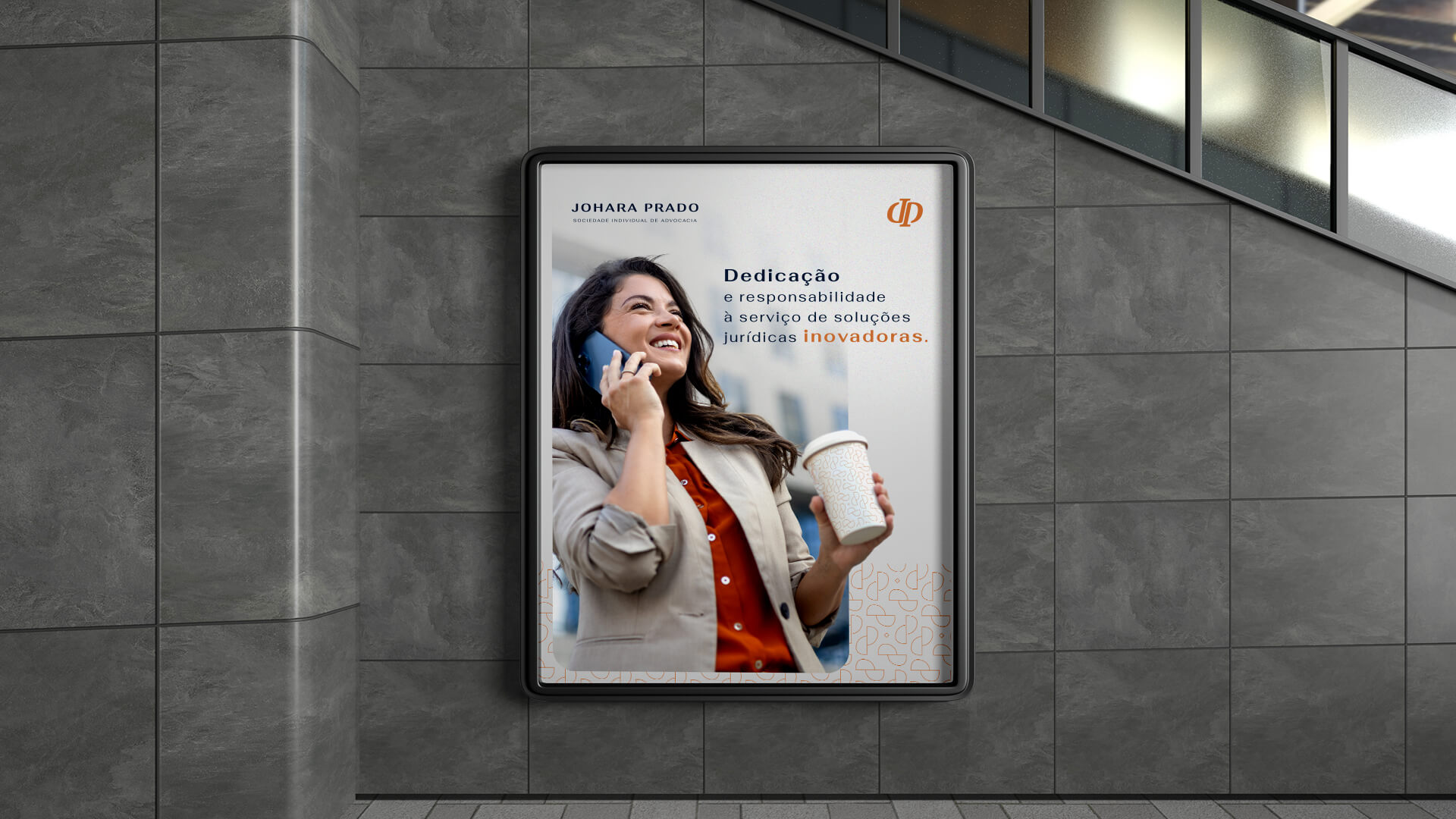
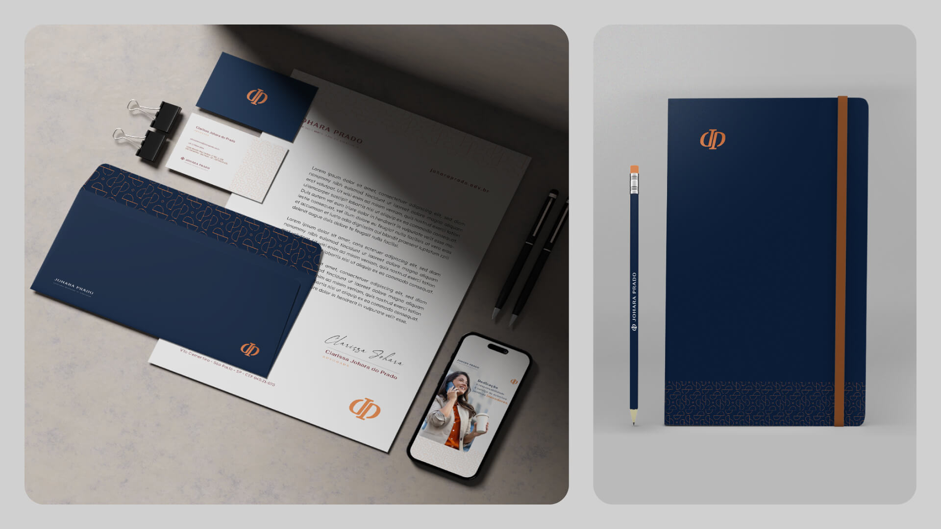
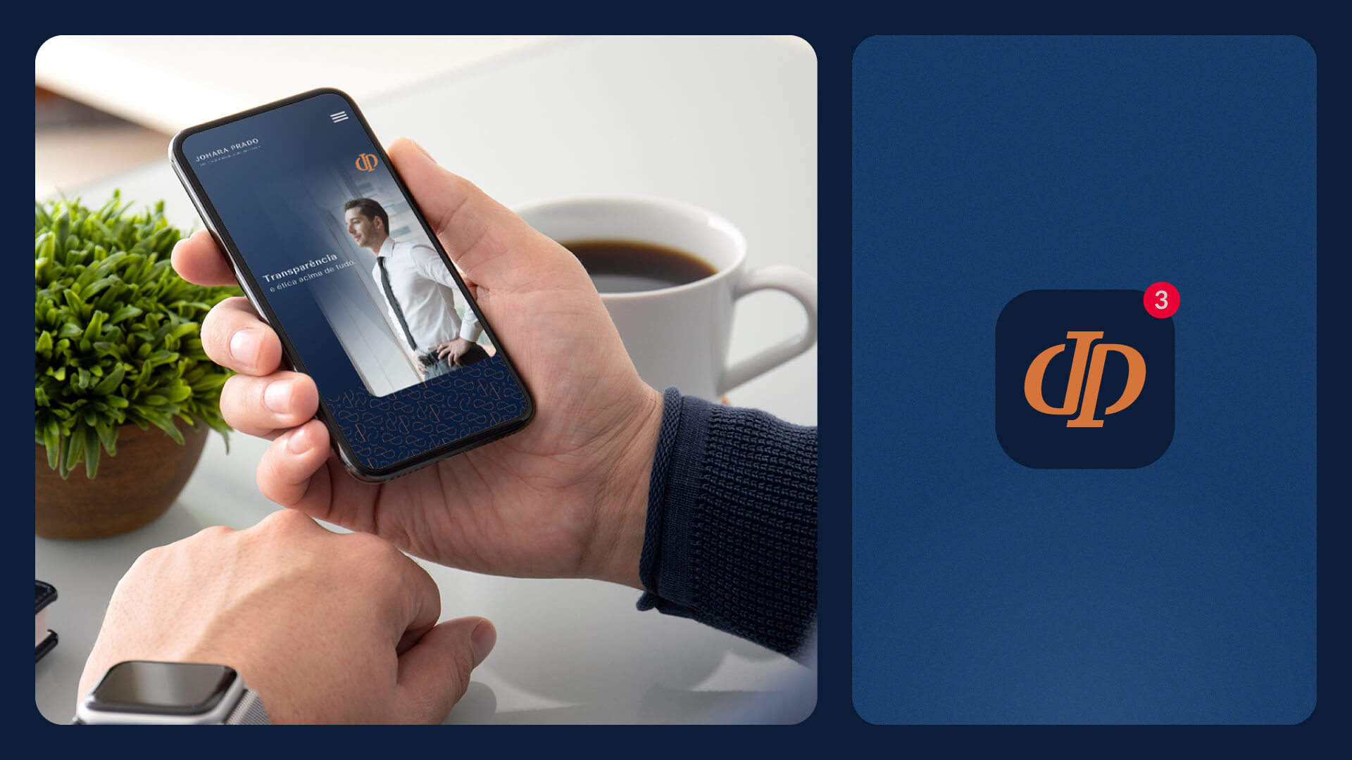
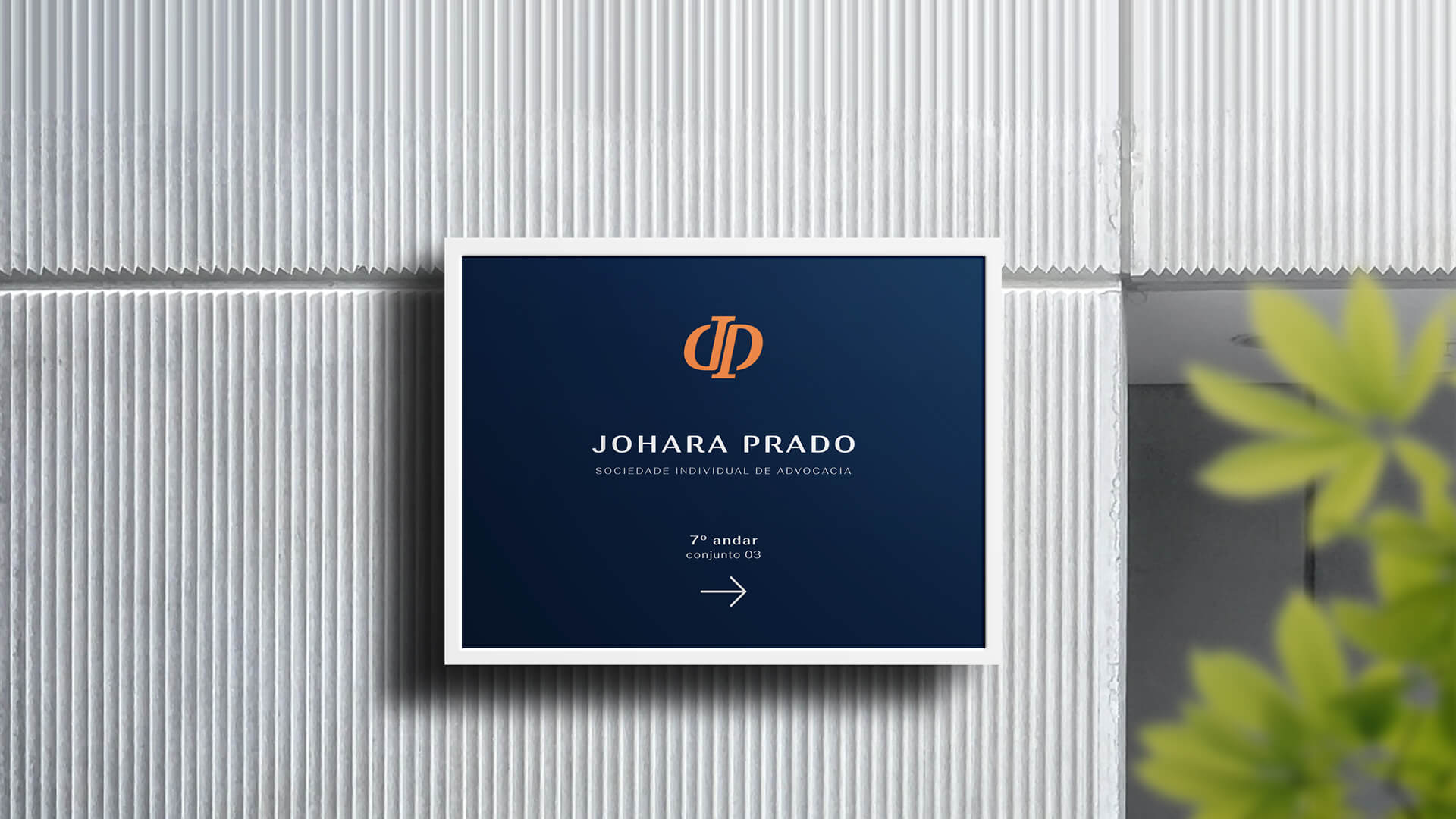
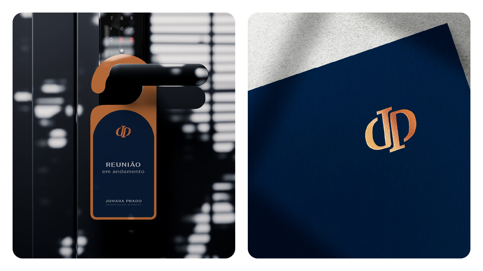
The more faded and conservative color palette gives the brand a serious, discreet and elegant look.
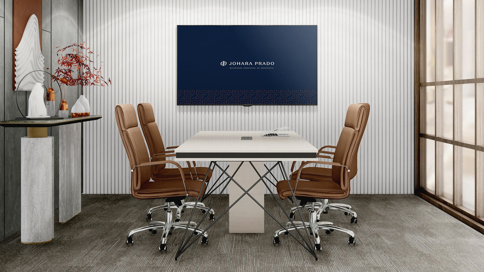
Copper details accompany the navy blue, giving a touch of elegance and refinement. A soft geometric pattern was created that echoes the shape of the logo and complements the supporting pieces.